Expand images by clicking/tapping
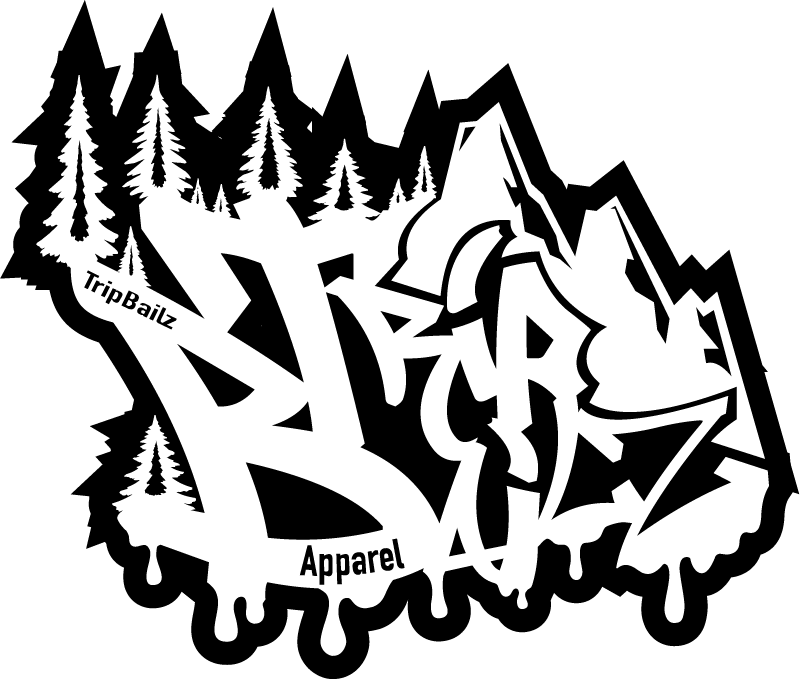
Original TripBailz Apparel Logo (Not My Design)
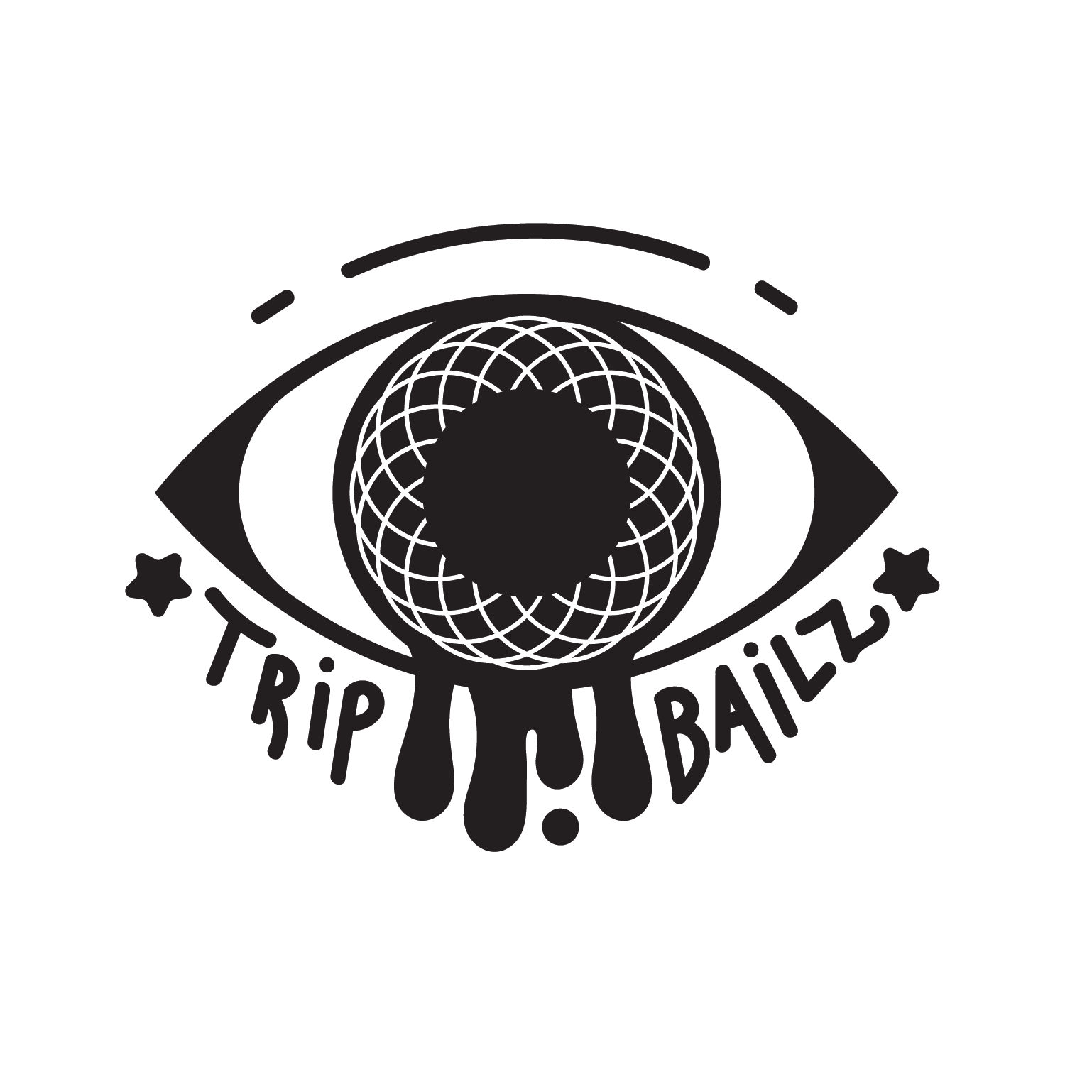
Redesigned TripBailz Apparel Logo (My Design)
PROBLEM
TripBailz Apparel needed a new logo that was easier to read than their original graffiti-style one but still captured the trippy, hallucinatory vibe behind the brand’s name.
TripBailz Apparel needed a new logo that was easier to read than their original graffiti-style one but still captured the trippy, hallucinatory vibe behind the brand’s name.
SOLUTION
I designed a bold, playful logo featuring an eye with a geometric shape around the pupil that creates a subtle optical illusion: the pupil looks like it expands when you stare at it. I added drip effects to nod to their graffiti roots and used a clear, handwritten-style font to keep things readable.
I designed a bold, playful logo featuring an eye with a geometric shape around the pupil that creates a subtle optical illusion: the pupil looks like it expands when you stare at it. I added drip effects to nod to their graffiti roots and used a clear, handwritten-style font to keep things readable.
RESULT
The final logo was eye-catching, memorable, and stayed true to the brand’s vibe. It helped TripBailz stand out visually and made the brand more appealing to new customers.
The final logo was eye-catching, memorable, and stayed true to the brand’s vibe. It helped TripBailz stand out visually and made the brand more appealing to new customers.
Home | About Me | Print | Digital | Photography | Video | Logo | Illustration | Contact