Expand images by clicking/tapping
PROBLEM
Herb & Flower Farm needed a logo that reflected their brand, appealed to their audience, and stood out from the competition.
Herb & Flower Farm needed a logo that reflected their brand, appealed to their audience, and stood out from the competition.
SOLUTION
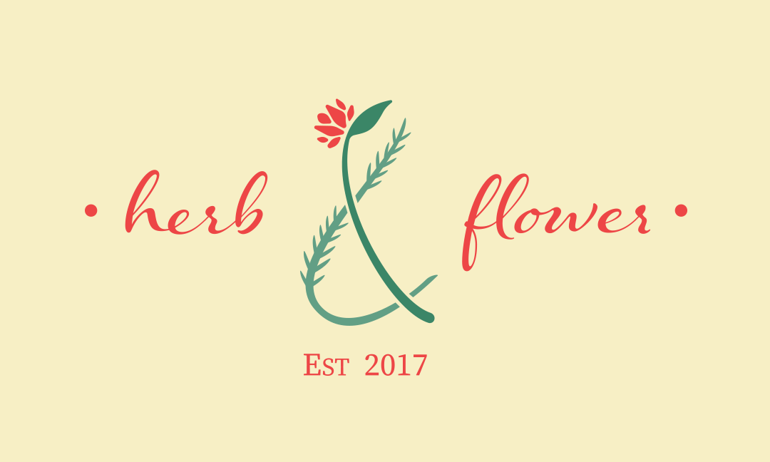
I created a logo using the ampersand as the base, weaving together an herb and a flower to form the "&" symbol. The design was simple, cute, and memorable, blending natural elements to reflect what the brand is all about.
I created a logo using the ampersand as the base, weaving together an herb and a flower to form the "&" symbol. The design was simple, cute, and memorable, blending natural elements to reflect what the brand is all about.
RESULT
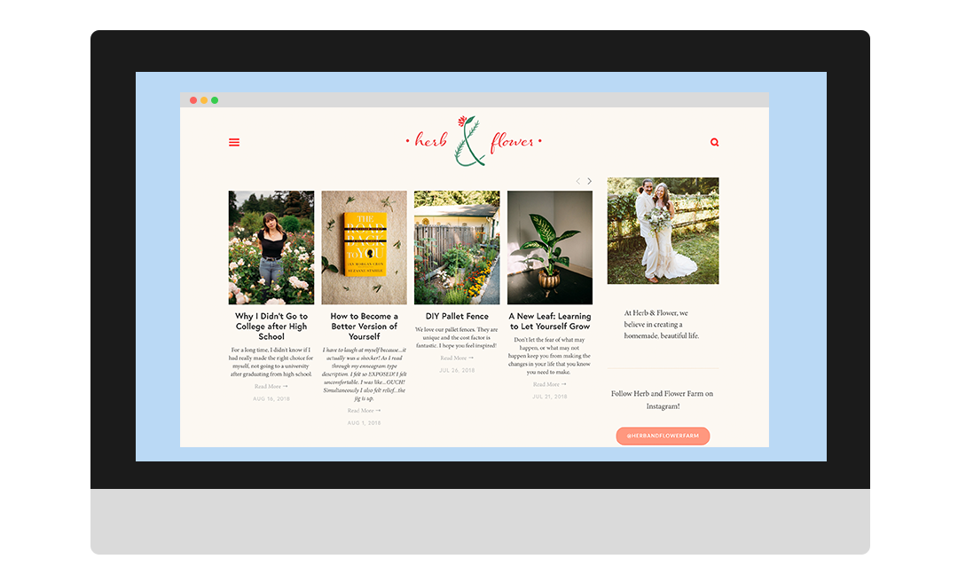
The logo was a hit with the Herb & Flower Farm team. It gave the brand a clear identity, helped attract new customers, and set them apart in the market.
The logo was a hit with the Herb & Flower Farm team. It gave the brand a clear identity, helped attract new customers, and set them apart in the market.
Home | About Me | Print | Digital | Photography | Video | Logo | Illustration | Contact